ACHS
Project
Case Study
Skills
UX/UI
Branding
Responsive
Figma
Collaborators
Cat Penrod
Sean McKeown-Young
ACHS
Research
(ACHS)
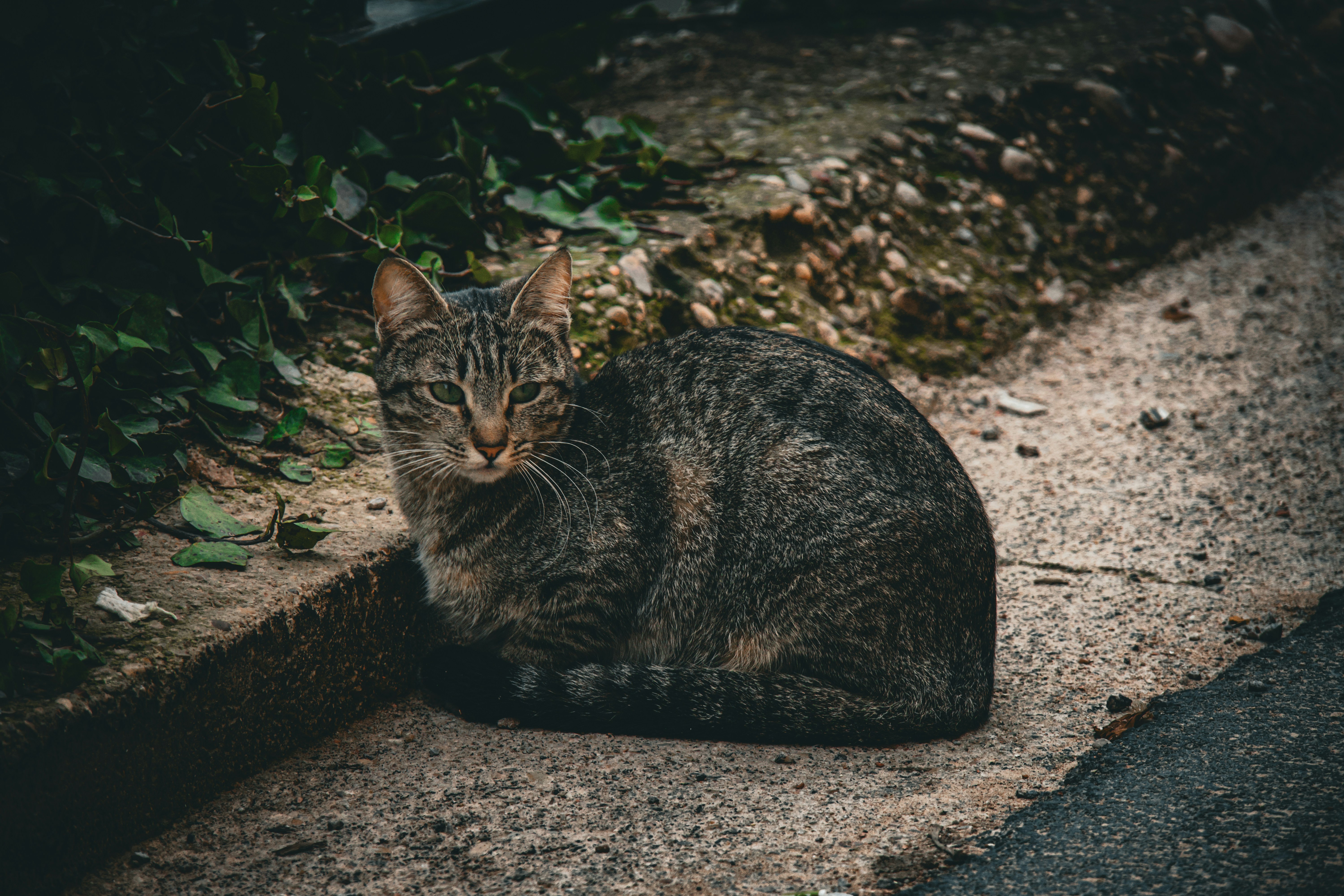
Through discussions with an industry expert we learned that small non-profit organizations are often in need of more donors and volunteers. The ACHS was no different. Many of the services they provide had long wait lists due to a lack of funding and volunteers.
Research
(Users)
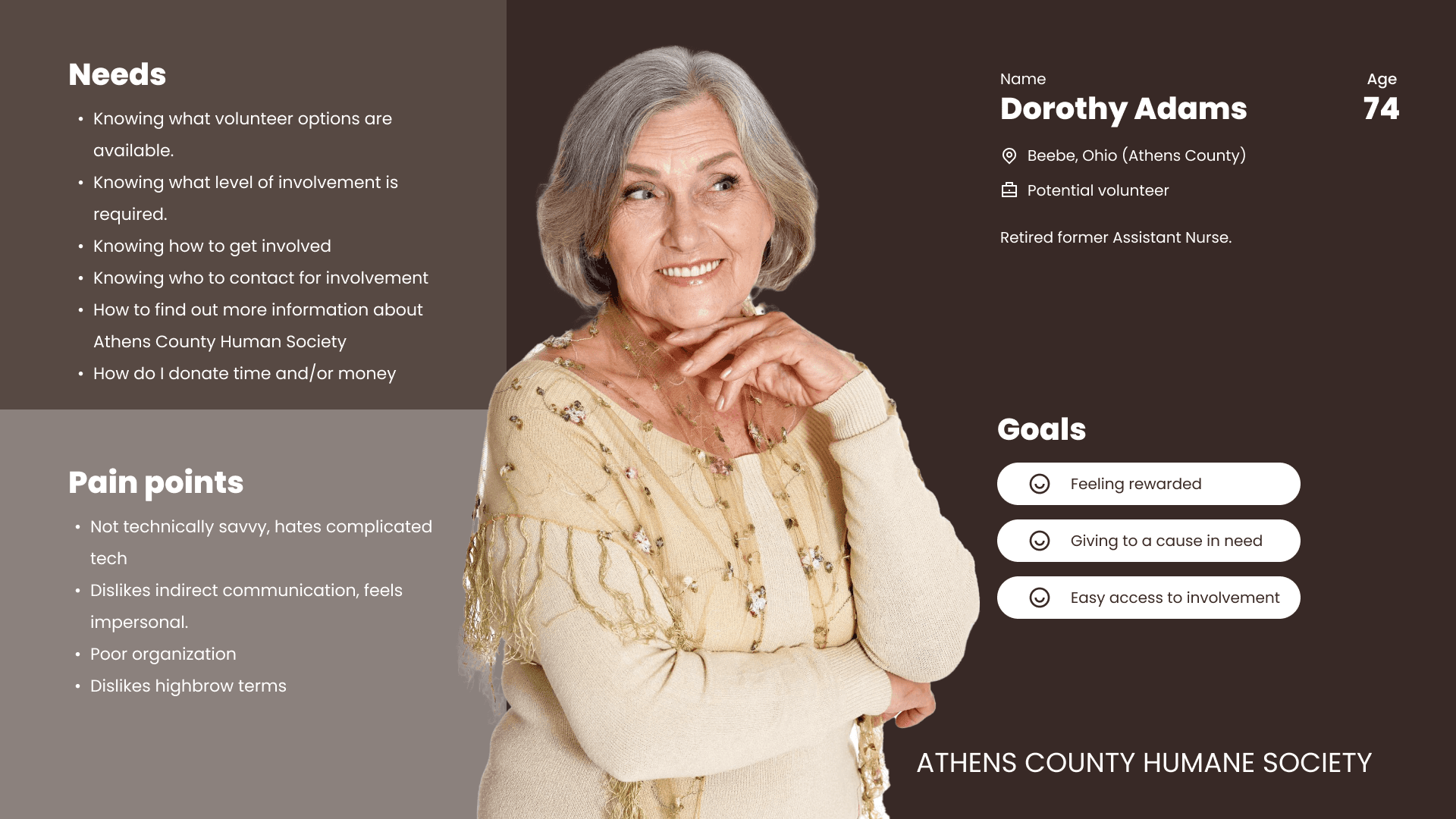
The target demographic for our users was informed by our independent research and confirmed by the industry expert we spoke with. That demographic being Caucasian women who are 50+ years old.
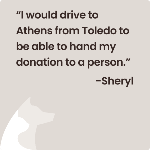
User interviews with individuals within this demographic revealed that they had an extreme willingness to contribute to causes like the ACHS. We also gained insight into many of the issues they encounter with technology when attempting to contribute.

Ideation
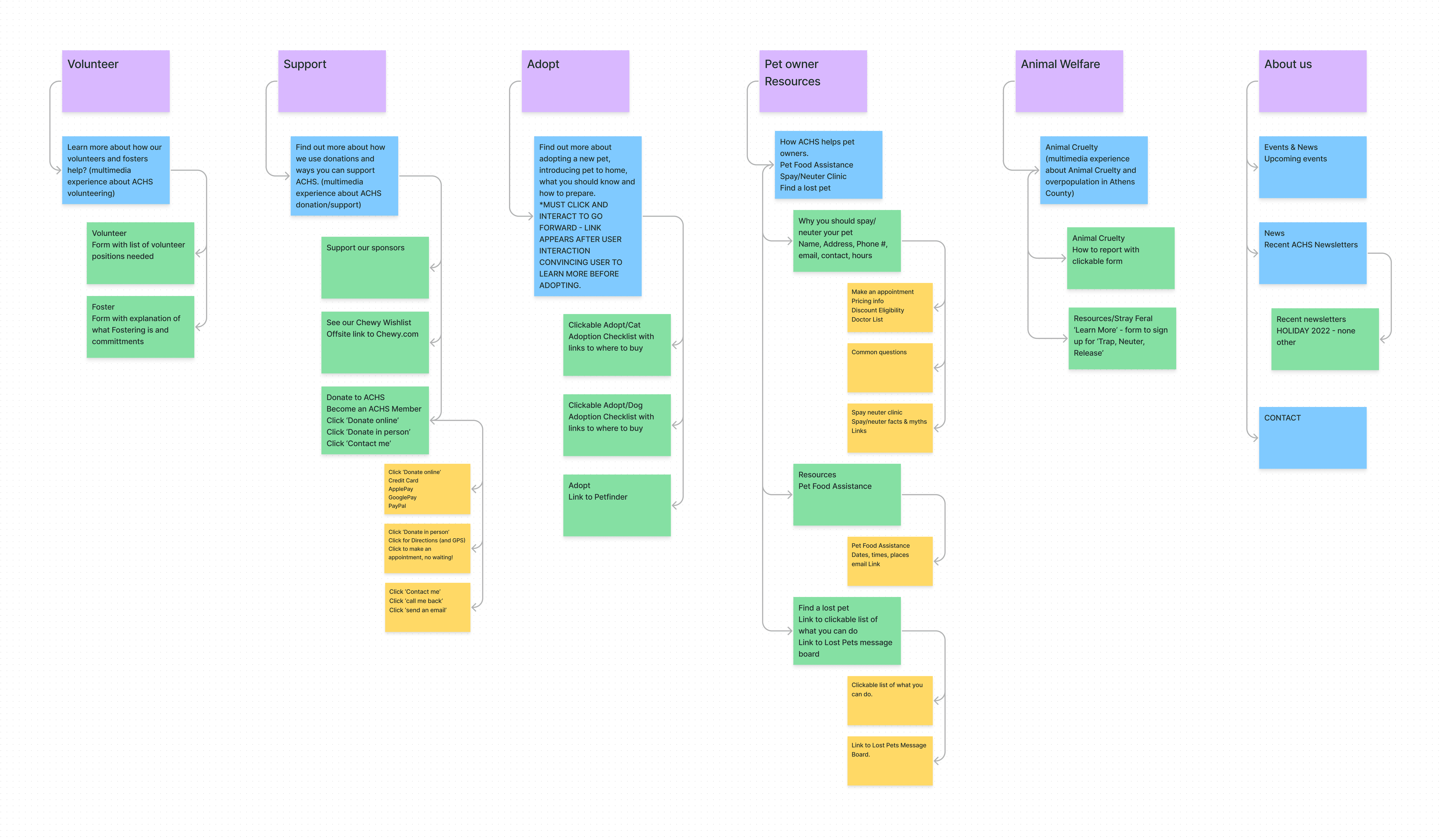
After completing a heuristic analysis of the existing ACHS website we quickly noticed that the existing navigation made it difficult for potential donors and volunteers to find the resources they needed.
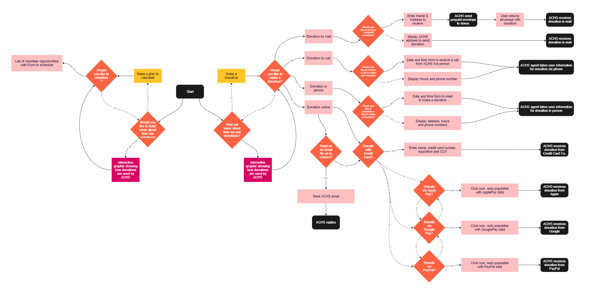
With the information obtained from our research, industry expert, and users, we began ideating a new navigation. Additionally, we creating a user flow to better outline how users were navigate through those specific processes.
Wireframes
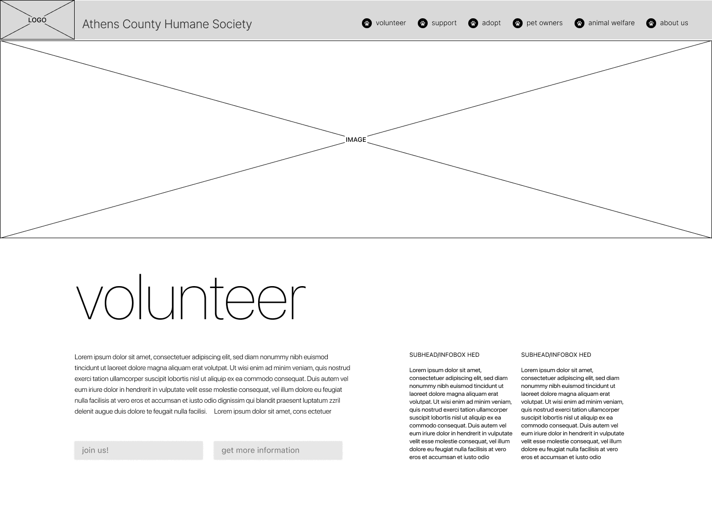
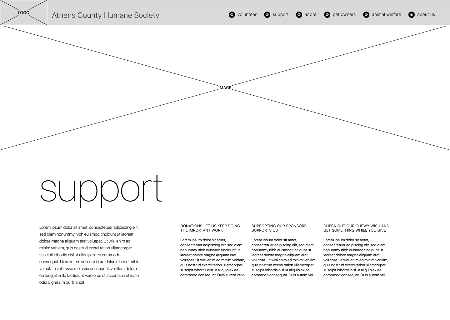
Early designs focused mainly on adapting pages from our ideated navigation. We wanted to place an emphasis on page consistency to ensure that the users would be able to easily scan pages to find the information they needed.
Style Guide
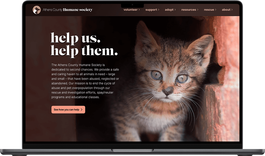
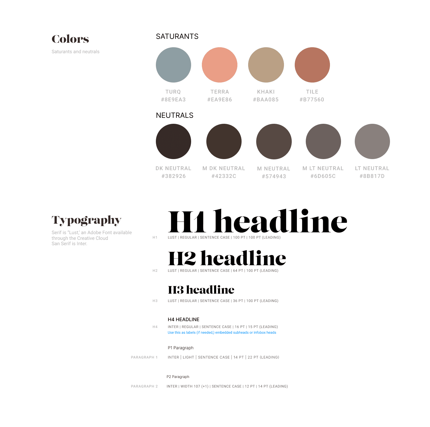
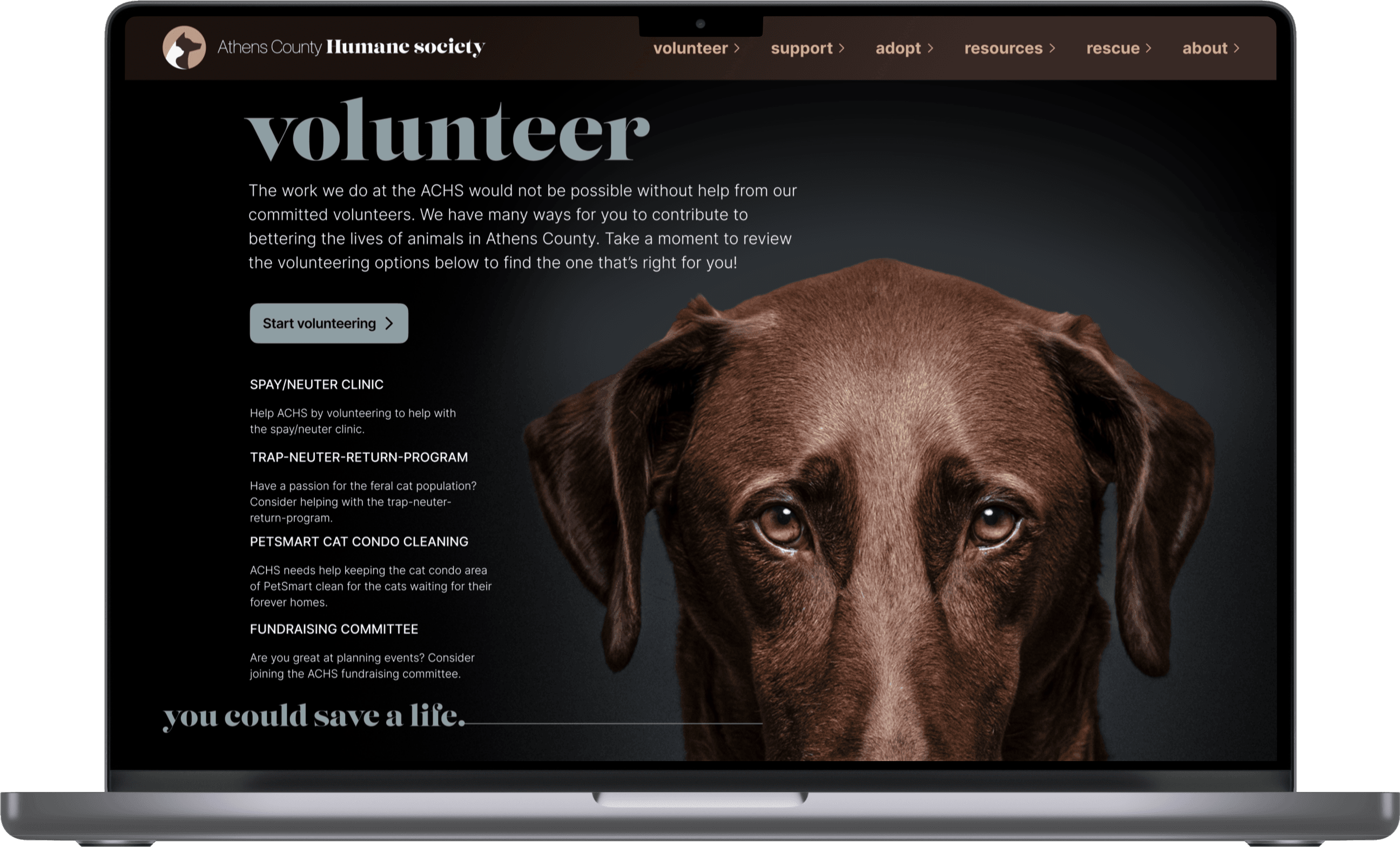
A primary goal of this project was to use color and typography effectively to influence user decision making. We felt that we could create an atmosphere and identity for the ACHS and our website that would be more likely to gain contributions from users.
To do this we used a serif typeface for our headers, and shades of brown for our neutral colors. Studies show that serif typefaces and the color brown both convey a sense of trust and reliability, things we felt were important to convey to our users. Our saturant colors all fell within what we called "earthy tones" which mimicked things like clay, stone, and animal fur. These colors were again used to provide a sense of trust, reliability, and thoughtfulness.
High Fidelity
Prototype
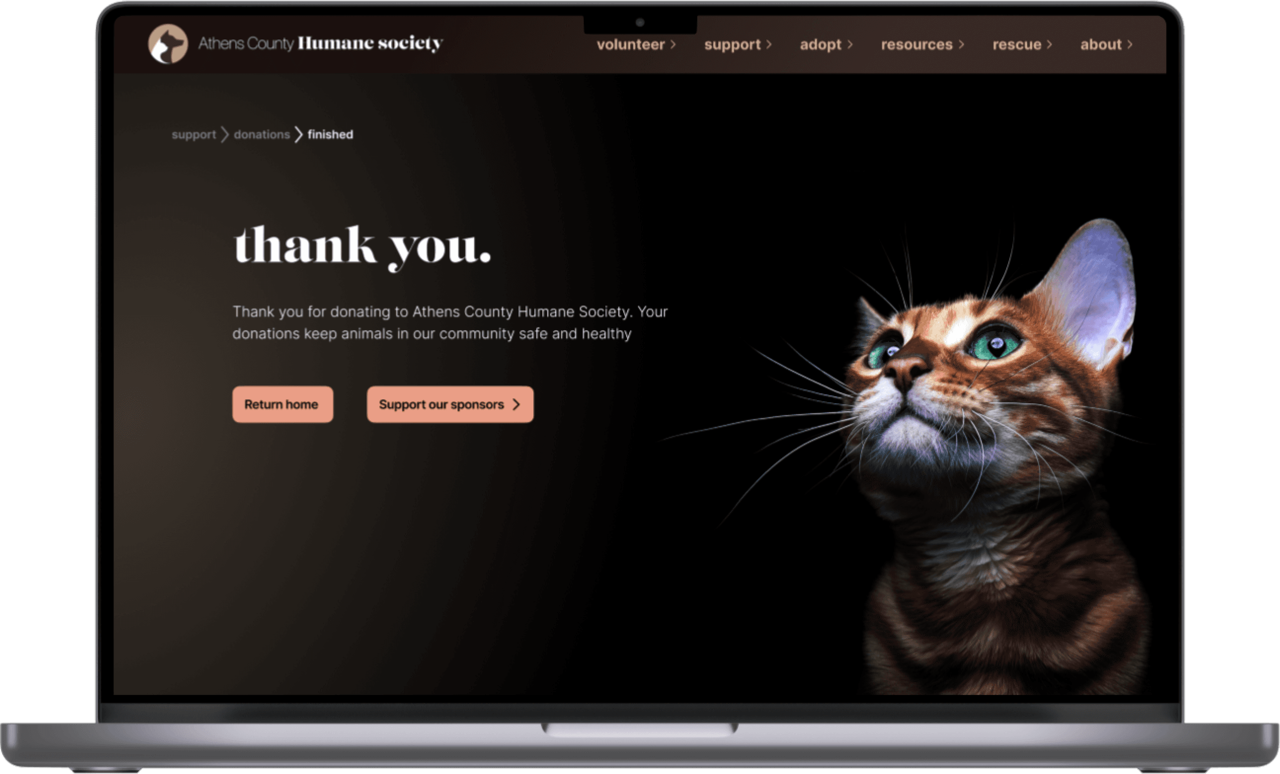
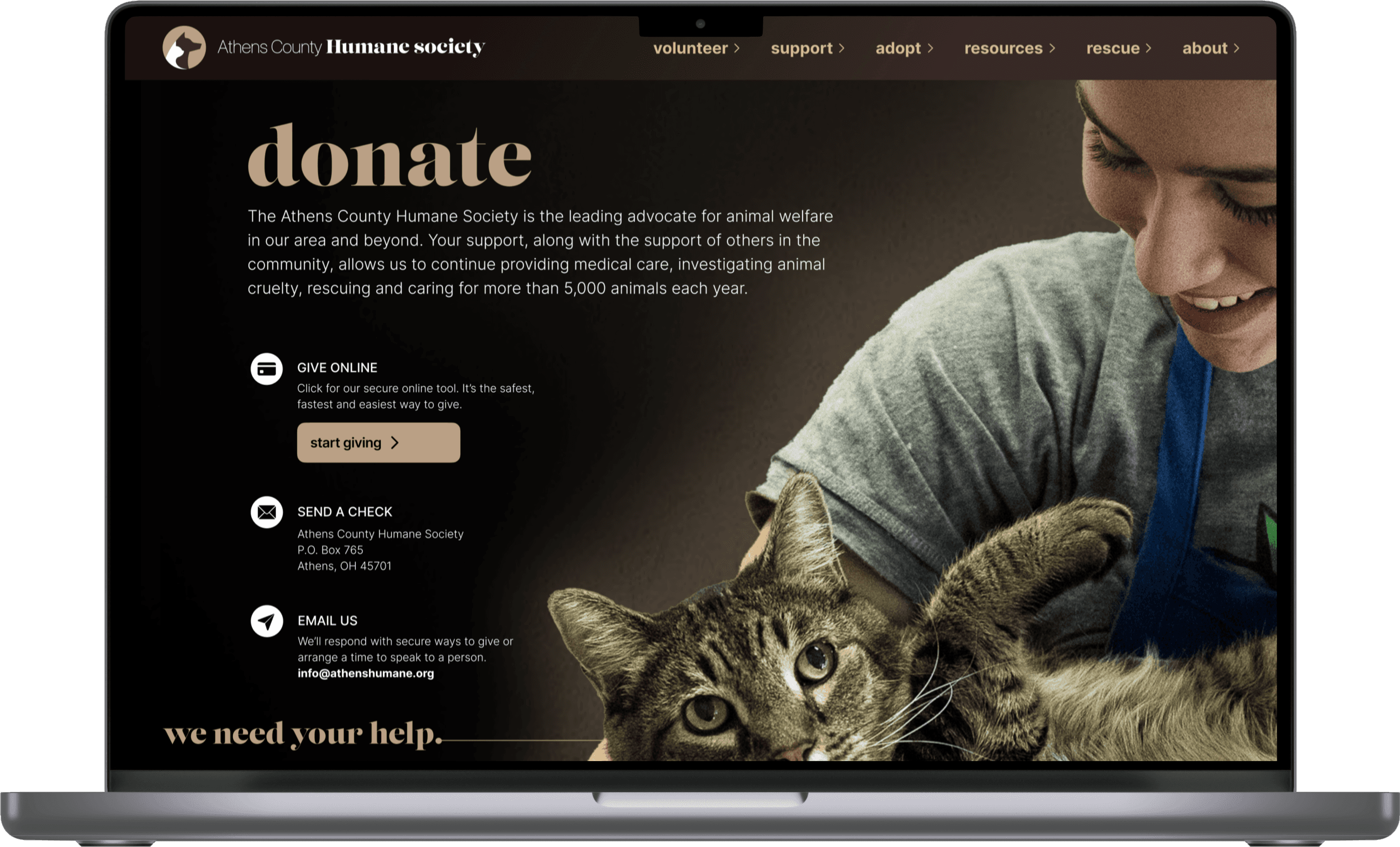
With our core design concepts and visual style solidified it was time to create our high fidelity prototype. We continued to focus on creating consistent page layouts, with our main focus being on volunteer and donation opportunities.
It was also important to us that users felt they were making an impact with every action they took. Strong, emotional imagery and recognition for their contributions were two key factors that ensured users felt fulfilled.
